Section 2
Short Bio. Clean, like this (below), with the dove as the watermark
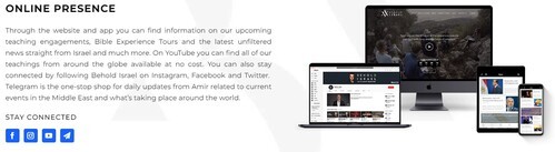
Join Us Online
I don't know if Bible Library or Join Us Online should be next.
On the right here is the app-promo block but the behold site doesn't actually link this block to the app down load, probably a mistake.
I like the positioning of the social links. We would have FB, IG, YT, & maybe a link for the phone app, even tho the app promo block is here
Bible Teaching Library
I think the Bible teaching Library section needs to be a primary draw,
but it we make it look too much like the top promo section maybe we should move down a few sections.
Not sure on placement, but this is actually what this ministry is primarily known for - for the past 20 years

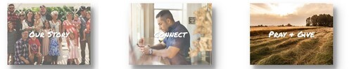
I really like this section - maybe edit the photos to match the darker look. I also like the pages these links go to, just color changes on those as well.
not sure where to put it on the home page, but I think it's good. The 'connect' link here does kinda duplicate the 'join us online' - put the 'connect online'
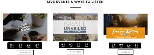
Live Events and Resources
Not sure how to make this different than the above section - & not sure where to put it - or if is too much -
probably shoudn't look too similar - but the 3 things I'm thinking is 'live sunday service' - 'resources' - weekly devo & prayer zoom mtg